Visual Abstraction: Velázquez, Picasso and Klee
Let’s take a look today at a section of a very famous painting:
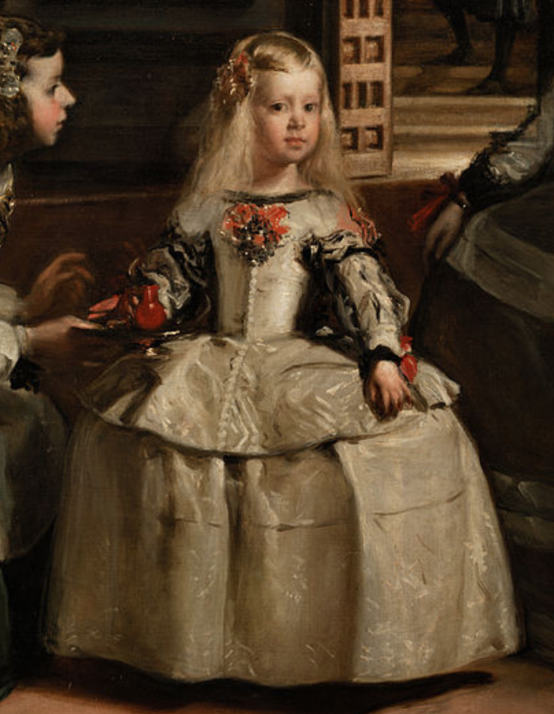 The Infanta Margarita Teresa from Las Meninas, Diego Velázquez. 1656, oil on canvas. Museo del Prado, Madrid. Full, high-resolution picture available on the Prado Museum’s website.
This is part of Diego Velázquez’s 1656 masterpiece, Las Meninas.
Look at the detail in Velázquez’s painting: the brushstrokes in the hair, the shadows of the folds of the Infanta’s skirt the way light comes off the red cup and off the Infanta’s face. Naturally, the technique to create these effects were well-understood by Velázquez’s time — it’s not as if he was the only painter capable of rendering life-like figures — but I want you to pay attention to the sheer amount of work needed to produce this painting in comparison to the homage made by a much later Spanish master, also considered to be on the vanguard of art for his time:
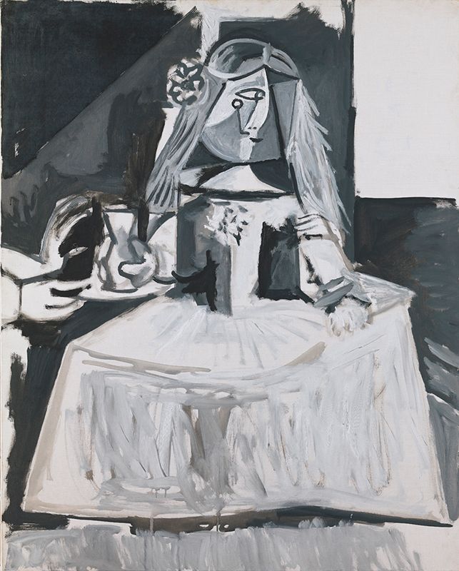
 Las Meninas (Infanta Margarida Maria), Pablo Picasso. 1957, oil on canvas. Museu Picasso, Barcelona. Picture taken from Museu Picasso’s blog post, The chronology of Las Meninas of Picasso.
There are some obvious differences, of course. Picasso’s rendition of Las Meninas restricts itself to white, black and grey (other versions of Picasso’s Las Meninas are available in colour, but you probably shouldn’t be looking at a Picasso if life-like colour is what you want). The Infanta’s face is now characteristically Cubist: angular planes in different shades, rather than the smooth boundaries between light and shadow in Velázquez’s painting. Gone are Velázquez’s fine, blended brushstrokes — instead, we have Picasso’s broad bold lines.
It’s easy to deride modern art as lacking technique and craftsmanship compared to the masters of old. Which raises the question: what is it that Picasso’s version offers us, really?
Two posts ago, I looked at abstraction in computer engineering. Broadly speaking, abstraction in this sense is about isolating structure from operations. Transit maps show you the structure of the transit network while abstracting away the actual running of the buses and trains. In my last post, I laid out the distinction between icons and symbols in semiotics, and compared it to representation and abstraction in visual arts. An icon is more representational: it resembles its real-life counterpart in some meaningful way. As icons become more symbolic, they become more abstract, and they lose that representational quality. What these symbolic images gain, however is a greater clarity of structure.
If we go too far to the symbolic end of the scale, that structure becomes entirely arbitrary — recall that Charles Sanders Peirce characterised the relationship between “symbols” and their objects as being of an “imputed character” — but between those two extremes, there are plenty of possible ways to represent real-world objects in structurally interesting ways.
Let’s return to Velázquez and Picasso for a moment.
 The Infanta Margarita Teresa from Las Meninas, Diego Velázquez.
 Las Meninas (Infanta Margarida Maria), Pablo Picasso.
Picasso has abstracted away a number of dimensions here. He isn’t concerned about the direction of light and shadow. The delicate folds on the Infanta’s skirt have been replaced by broad grey vertical brushstrokes that recall, but do not represent, shadow. In Velázquez’s painting, the sides of the Infanta’s torso are in shadow; Picasso effectively abstracts away shading (and the perspective that shading provides) by painting two fields of grey and black on the sides of the Infanta’s chest. Her cheeks receive a similar treatment. Neither does Picasso seem concerned about curves: the gentle arcs of the dress and skirt of Velázquez’s Infanta is replaced by direct and straight lines; the bulbous shape of the cup in the Infanta’s right hand transforms into an angular vessel.
By abstracting these elements away, Picasso reveals, essentially, a wireframe of the Infanta.
In fact, his sketches reveal an even more abstracted version of Las Meninas, including an even more brutally abstract Infanta:
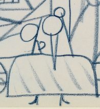 Crop of the Infanta Margarita Teresa from Sketch for “Las Meninas”, Pablo Picasso. 1957, blue pencil on paper (page from a sketchbook). Museu Picasso, Barcelona. Picture taken from Museu Picasso’s blog post, The chronology of Las Meninas of Picasso.
It looks like a child’s drawing, doesn’t it? That’s perhaps one of the greatest mysteries of the human mind — that children, looking at a scene or a painting, even one as intricate as Las Meninas, will instinctively isolate shape and colour, and abstract away everything else. Never mind the actual substance of the pigment on the canvas! We don’t see blue crayon on paper or ochre on canvas — the structure of the image exists in our minds as something independent of the individual brushstrokes. And that’s part of the genius of Picasso, Braque, and the rest of the Cubists: they painted not according to the perception of the eye, but according to the perception of the mind.
Going Further: Isolating Colour
Colour has taken possession of me; no longer do I have to chase after it, I know that it has hold of me forever… Colour and I are one. I am a painter.
— Paul Klee, 1914
What happens when you remove shape from the equation, and leave only colour?
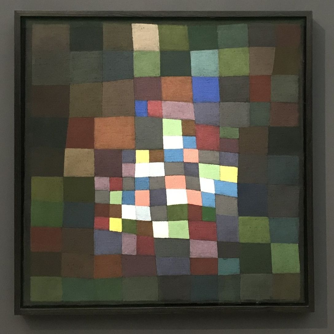
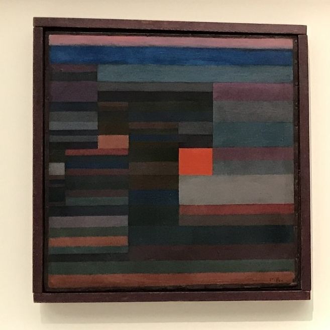 Feuer Abends (Fire in the Evening), Paul Klee. 1929, oil on cardboard. Museum of Modern Art, New York City (picture taken while the work was on loan to the Fondation Beyeler, Riehen).
Paul Klee’s Fire in the Evening is a painting that, without its title, is difficult to anchor to the real world. Nonetheless, there are things we can read from it, if we know what to look for. Klee’s paintings has shapes, of course, but no representational shapes. Even Picasso’s Infanta is recognisably a girl wearing a dress, but all Klee gives us are rectangles. That does not mean that Klee has completely left the realm of representation. He just happens to have abstracted away much more than most artists.
The painting features two keys axes of contrast. First, there is a series of horizontal bands of colour, broken by a series of implied vertical lines. Secondly, there is the fact that this painting’s colour palette includes a variety of dark or dull shades, and a single field of bright, scarlet red.
Klee’s innovation here is not the use of red for fire — that is trivial. Instead, it is in his recognition that in a fire scene, it is not the colour per se that the eye is drawn to, but the contrast. The most arresting images of fire are created not by the colour of fire itself, but by the contrast of light against dark, which is why you rarely ever see great photos of fires taken during the day. Klee tapped into the fundamental structure of fire imagery, and abstracted away nearly everything else.
We don’t know where Fire in the Evening is set, and yet there is an unshakeable feeling that the painting we are looking at is a landscape. Why? Here’s my theory: the dominance of the horizontal lines is a primal expression of the structure of the landscape. All landscape compositions are constructed relative to the horizon.
So, instead of painting a landscape, Klee paints a proto-landscape, an underlying representation (sorry, linguistics joke) of all landscapes, with brown and green bands dominating the lower third of the painting representing the land, and blues and pinks dominating the upper two-thirds. The vertical lines that interrupt this horizontal composition, then, represent objects that interrupt the horizontality of landscapes, such as buildings or trees.
The title Fire in the Evening, at least, gives us a visual image we can use as a territory to map Klee’s painting onto. In some other cases, though, the object of Klee’s painting is not a landscape, but a feeling:
 Blühendes (Flowering), Paul Klee. 1934, oil on canvas. Kunstmuseum Winterthur (picture taken while the work was on loan to the Fondation Beyeler, Riehen).
Here, Klee again uses a contrast of dark and light colours. Unlike Fire in the Evening, however, the contrast isn’t representational. Nobody goes looking for blooming flowers in the dark. Instead, the relationship between the technique — colour contrast — and the subject matter of the painting is indexical and metaphorical: light, spreading from the centre of the canvas to its edges, as a visual metaphor for spring after winter, and for creation out of darkness. The fractal-like quality of the small squares expanding outwards and into the larger squares contributes, too, to the sensation of growth. This, too, is an abstraction: Klee has found a way to express the structure, the form of the idea of “flowering”, rather than a representation of it.
Contrast is not the only technique that Klee used. Klee was an accomplished musician, and he understood that harmony was just as valuable a tool as contrast and dissonance:
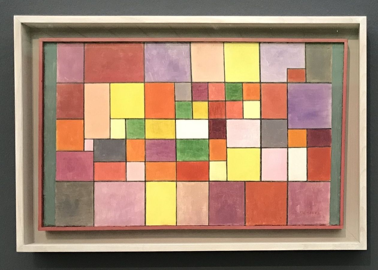 Harmonie der nördlichen Flora (Harmony of the Northern Flora), Paul Klee. 1927, oil on cardboard. Zentrum Paul Klee, Bern (picture taken while the work was on loan to the Fondation Beyeler, Riehen).
In Harmony of the Northern Flora, Paul Klee arranges his rectangles of colour such that they create an impression of vibrant coherence. It isn’t the case that he hasn’t used contrasting colours — we find blue next to orange, green next to red, yellow next to purple — but unlike Fire in the Evening or Flowering, the colours have been arranged not to draw immediate attention to one particular section of the canvas.
The arrangement of rectangles, too, contributes to this coherence. While Fire in the Evening created the bracing contrast of horizontal and vertical, and of bright red against dark tones, Harmony of the Northern Flora does not generate this effect. Somehow, the black lines outlining the rectangles serve to pull the different colours together, drawing attention to their geometric unity rather than inviting contrast. The differently-coloured and differently-sized fields create visual interest without creating tension.
What is it that Paul Klee has done here?
Let’s take a look at the master painter of northern flora:
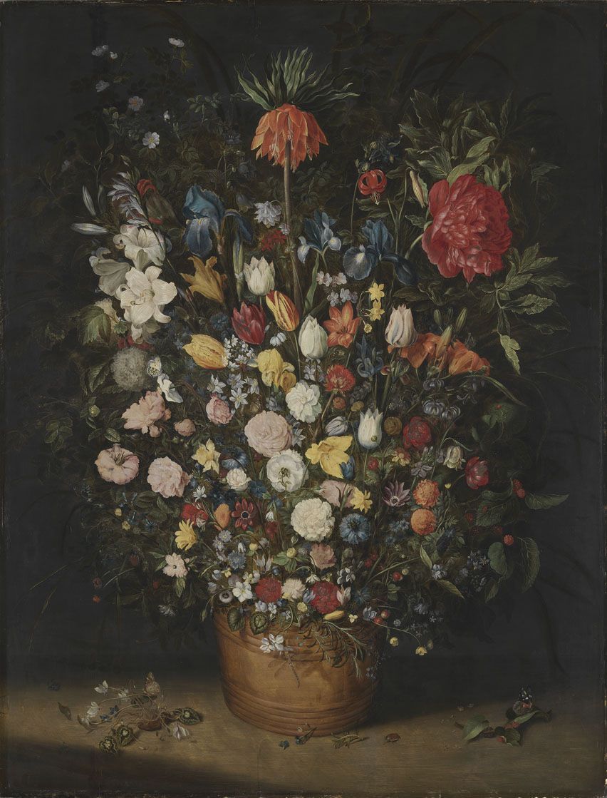 Großer Blumenstrauß (Big Bouquet), Jan Brueghel the Elder. 1606/7, oil on wood. Alte Pinakothek, Munich. Picture taken from the Pinakotheken collections website, used under a CC-BY-SA-4.0 license.
Jan Brueghel’s still life of flowers is representational and iconic. It resembles a bouquet of colourful flowers as they might exist in real life. Klee abstracted away everything but colour and geometric composition.
Recall that in the evolution of the Chinese writing system, the iconic logograms, with their curved lines and emphasis on shape, slowly became more abstract and symbolic, with lines becoming rectilinear and the relationship between the lines taking precedence.
That is what Picasso did to Velázquez, and what Klee did to flowers.
The Difficulty of Abstract Art
This is the challenge of abstract art. Because abstract art does not readily recall real-world scenes and images, it demands more of us as viewers. The work does less of the showing, so we have to do more of the seeing. And because abstract art seems to require less of the technical skill that representational art does, it is easy for us to dismiss it as juvenile, lazy or unskilled, when in fact it takes a supremely conditioned eye and mind to put on the canvas exactly enough to convey a sensation or an image, and no more.
The more abstract a signifier is, the more arbitrary its relationship with its signified, and the more malleable the sign. This is what makes abstract art so pliable and so famously “subjective”. Precisely because it is divorced from its real-world referent, abstract art allows us — invites us, even — to impose our own meanings upon it.
This is not a bug, but a feature: it forces the viewer to take part in the act of meaning-making.
Well – at least this is the meaning I’ve constructed out of abstract art, anyway. This is the only way I’ve managed to approach abstract art in a way that makes sense to me.